Iterative Testing for a Link Resolver
(iterative, guerrilla-style testing of one page in a larger workflow)
the challenge
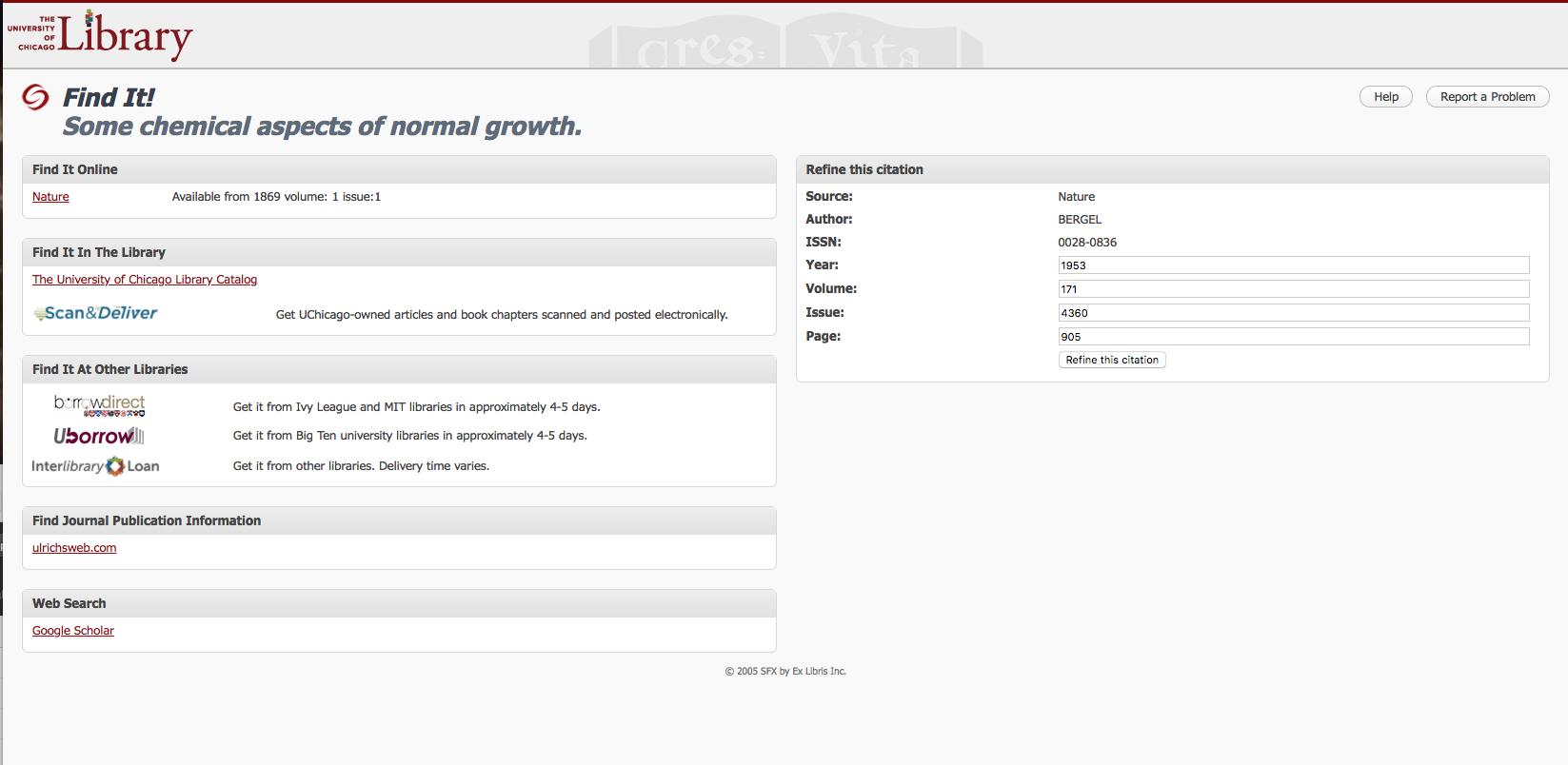
When students access resources through the University of Chicago, they often view the Library's "Find It!" link resolver page. Starting from a record in Google Scholar, WorldCat, or one of the Library's databases, they arrive at the Find It! page as they're trying to track down a PDF or physical copy of the resource.
In response, the Library used to provide links to any number of resources on that Find It! page:
- any database that included the resource, even if multiple databases had identical or overlapping coverage
- link to the Library's catalog, even if the item wasn't available in the collection
- links to three different interlibrary loan options, even though two of them had identical policies and could accommodate the majority of requests between them.
The page also linked out to more specialized research tools and had an overly complex search form.
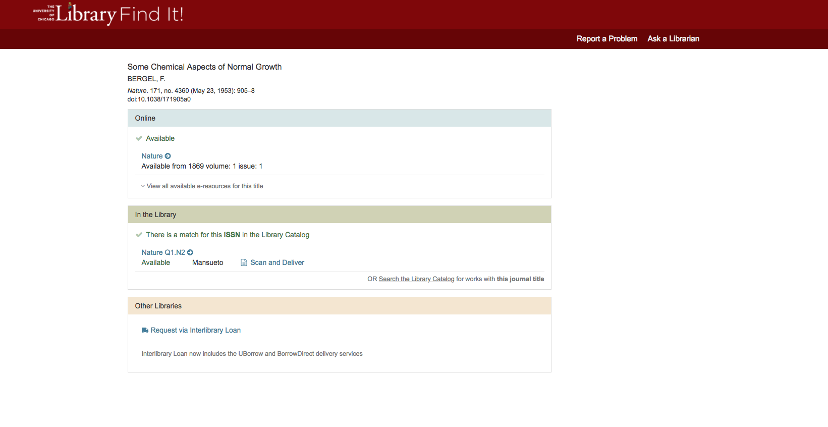
But then, three backend services were developed that had the potential to make this page a lot simpler.
- First, a programmer within the Library developed logic that would determine whether databases being shown on the page had identical coverage, and hide any redundant options.
- Second, a service pre-checking the catalog was introduced, so that students would be able to tell just from the Find It! page if the Library had the item, instead of going into the catalog and meeting with disappointment.
- Third, the Library consolidated its three queues for interlibrary loan into one queue. Now, instead of students picking one of three services, the Library would make the choice for them.
Now that it was possible on the backend to simplify the page, how could the UI be adapted to reflect this?
approach
statistics and web analytics
One of the first questions the Library's web team asked was, "How can we simplify this even further?" From the statistics provided by the vendor, we knew that at least three areas of the page (online, in the library, and interlibrary loan) were heavily used. There was no question of taking those options away from our users, and the backend services being developed would go a long way toward making them easier to use.
Other sections of the page were used only a few times a year, and often by librarians, not by general users. These options were probably too confusing to keep on the page, and we decided to remove them.
One section of the page that got a surprising amount of use was the search form, and we didn't have information on how that was being used. I asked for the link resolver to be added to our Google Analytics instance, so that I could track what was being searched from that page. Using a year's worth of that data, I found that people were using that search box to re-search for the resource that had led them to that page. Either they didn't understand what the search form was doing, or they didn't understand the page they were on. Based on that, I recommended that the search fields be removed from that page.
prototype testing
With this proposal for the scope of the page in mind, I was able to turn my mind to testing it. The page was just one point along a longer journey. It's linked from any number of databases, and it could still link out to many different resources, even with the streamlining.
Paper prototyping seemed too cumbersome. Ideally, the user would be able to just glance over the page to get where they need, and the low-fidelity of paper prototypes might generate closer scrutiny.
Instead, the Library's graphic designer created a mockup in HTML, and put in links to live resources where possible. I used InVision to link this mockup to screenshots of records where users accessed the Find It! page. During testing, users started at those screenshots, clicked on linked hotspots to arrive at the mockup, and used the links in the mockup to arrive at live versions of Library sites.
I recruited students for a think-aloud usability test, which I documented using Morae. After the students completed the tasks (all along the lines of "Show me how you would get a copy of X resource"), I gave them a short survey about labeling choices.
guerrilla-style usability testing
The first round of usability testing mostly uncovered issues in resources linked from the link resolver page, not usability issues on the link resolver page itself. Future rounds of testing had to be more focused to make the best use of resources for this project.
Instead of recruiting participants ahead of time and asking for 30-45 minutes of their time, I set up a table in a heavily-used area and flagged down students as they entered. Since I was recruiting them on the spot, I stopped the session once they had made it to the next step beyond the link resolver page. I also dispensed with Morae and recording. It didn't seem worth it for such a short session, and explaining the recording and its use would take up more time than the test itself. Instead, another librarian helped by taking notes.
This second round of testing was much more focused, and revealed a couple possible enhancements to the page's styling. I conducted a third round of guerrilla-style testing with another, more refined prototype. After that, the page seemed ready.
reporting and impact
For each round of testing, I created detailed reports that itemized the usability issues uncovered, and posted them to the Library's intranet. However, these reports were mostly for posterity. It was more important to share the results with the web team and with committees that were stakeholders in the redesigned page in person. I updated these groups when I had the opportunity, explaining each time the types of tasks that were used and how those reflected the real-world use of the page.
When we finally launched the redesigned page, more than a year after the backend services were initially proposed, the design was smoothly incorporated into student and staff workflows. In the month after the launch, the Library received only one complaint.
The biggest sign of the design's acceptance was the lack of late-stage questions from stakeholders later in the process: as the rest of the web team and I kept presenting refinements at meetings, we showed our colleagues that though these changes were sizable, we were pursuing them on behalf of our users and not just for cosmetic reasons.